Prodigy Education · Teacher Experience · 2022
Turning the Teacher Homepage from a banner dump into a daily starting point
Due to confidentiality, I am unable to publicly display my work.
Prodigy Education · Teacher Experience · 2022
Turning the Teacher Homepage from a banner dump into a daily starting point
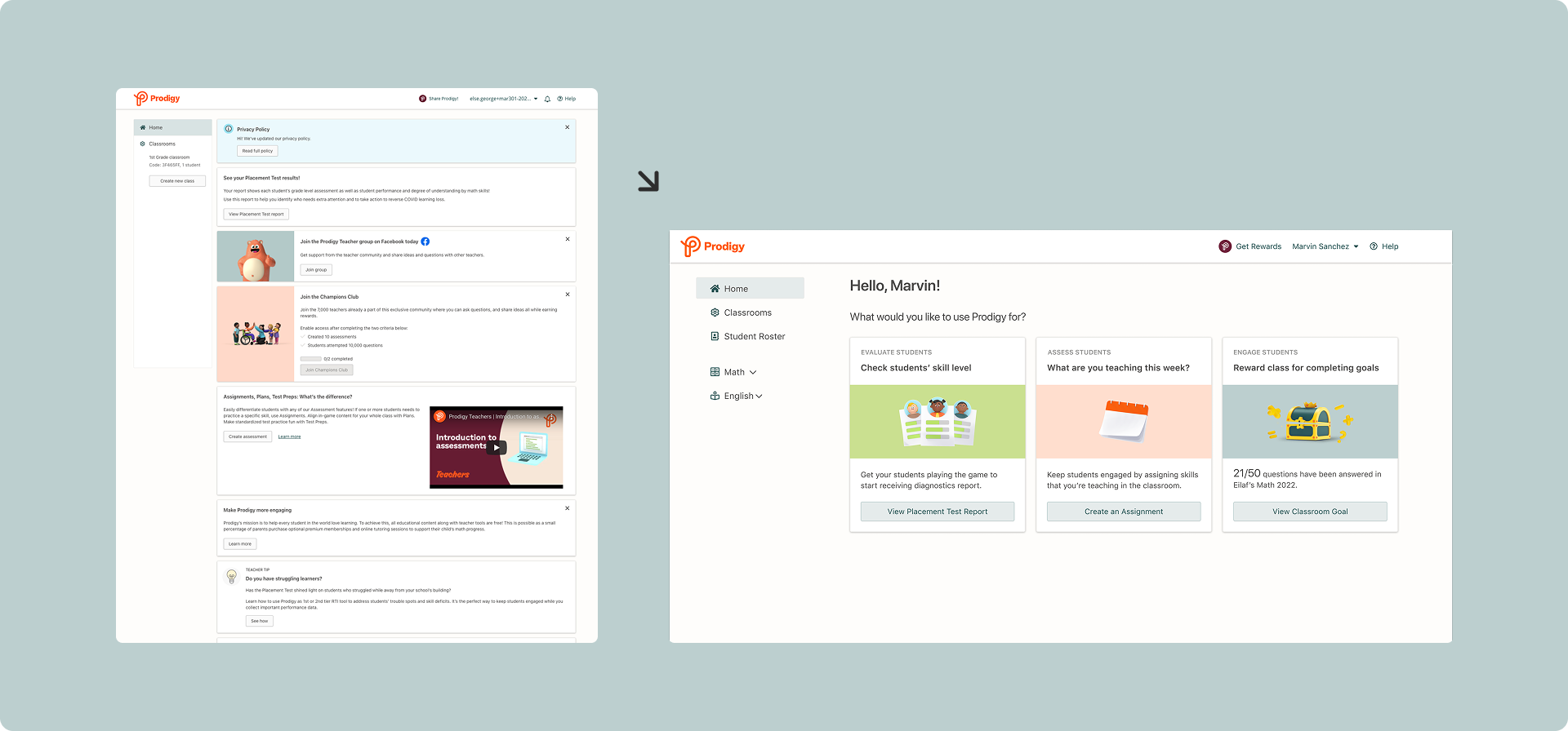
Prodigy's teacher homepage was a banner dump with 12 CTAs and stale content, each converting at under 1%. I redesigned it into an actionable landing page built around each teacher's journey. In the A/B test, teachers clicking at least one CTA jumped from 8.5% to 26.5%.
- My role
- Product Designer: research, interaction and visual design, experiment design
- Team
- Product Manager · 5 Engineers · Data Team
- Timeline
- Sep to Dec 2022 · Shipped
- Tools
- Figma · UserInterviews · Dovetail · Optimizely
01 · CONTEXT
The page we wrote off but teachers kept visiting
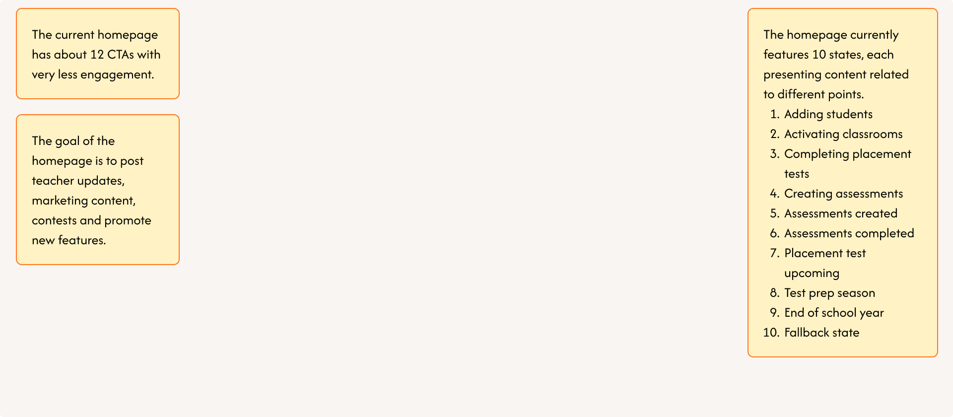
Prodigy is a game-based learning platform K-8 teachers use to assign math and English practice, run assessments, and track student progress. The homepage sits right after login, and by 2022 it had drifted into a marketing surface: contests, promo banners, and feature announcements stacked ten content states deep.
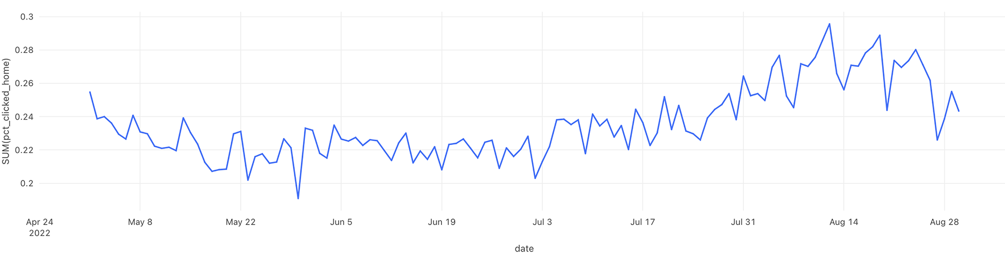
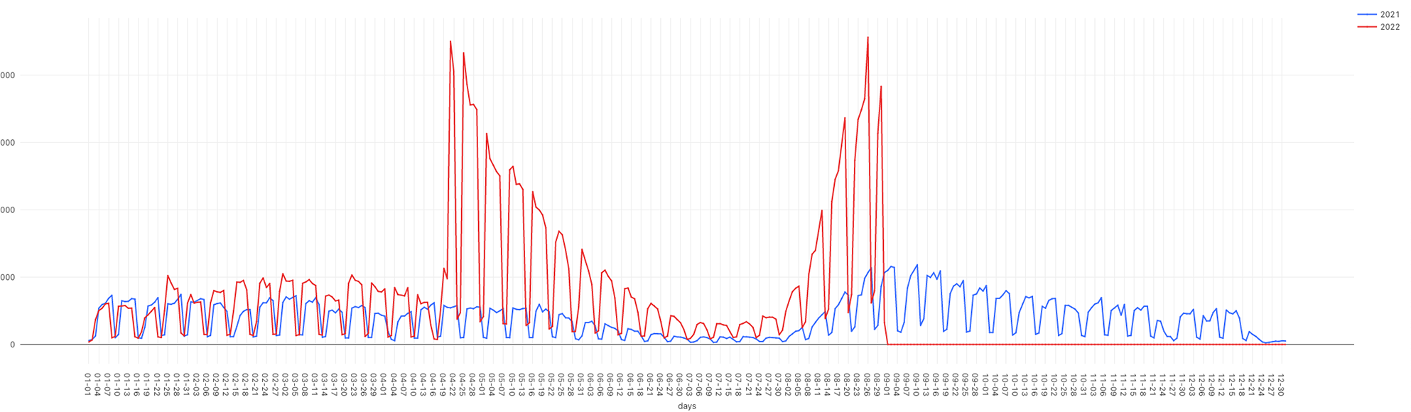
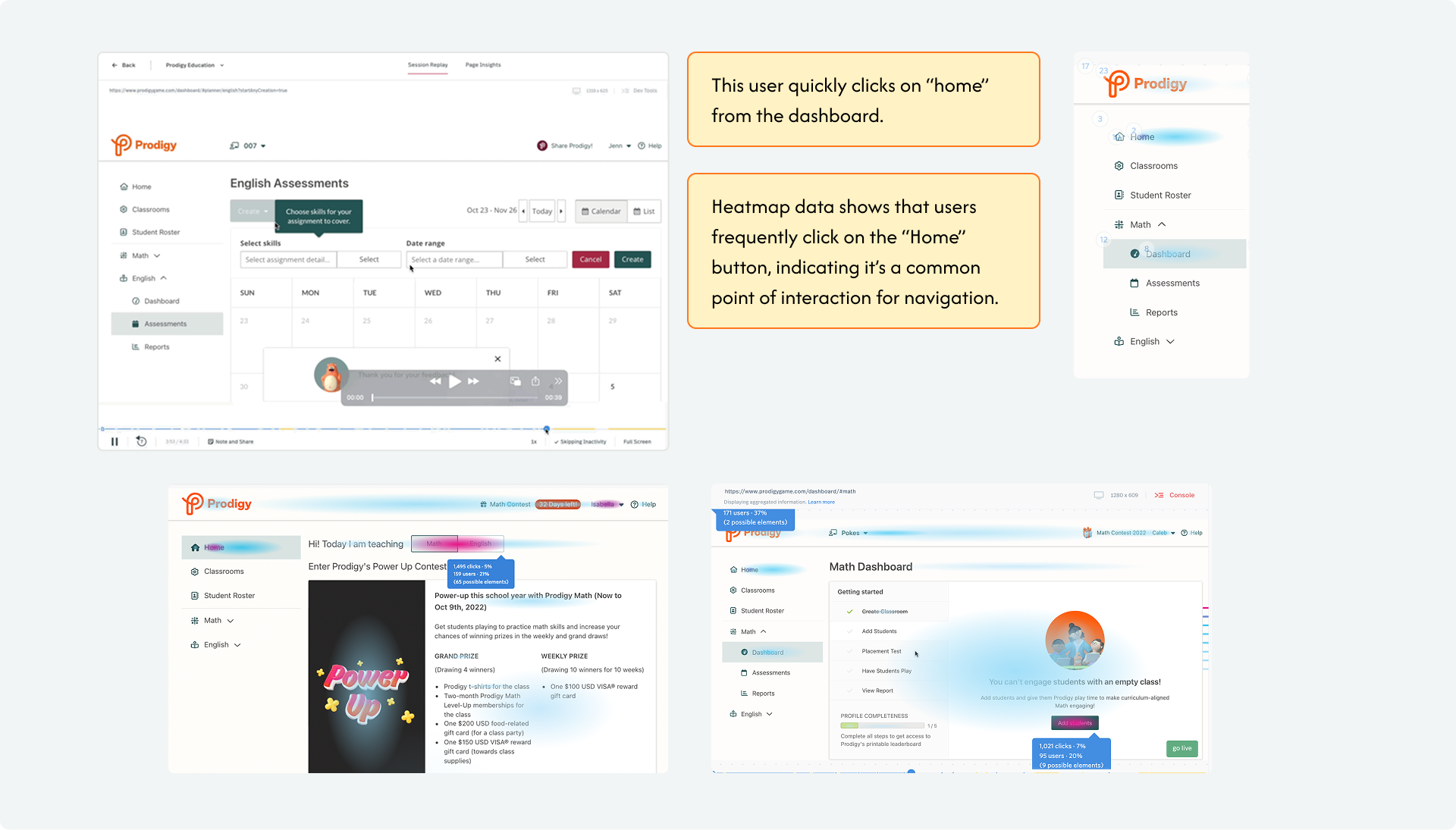
In August 2022, the team began routing teachers straight to their dashboard, assuming the homepage added little value. FullStory showed the opposite: clicks on "Home" went up after the change. Teachers were deliberately seeking out a page we'd written off. That contradiction became this project: I partnered with the data team to understand why.
02 · THE PROBLEM
Heavy traffic, near-zero action
Roughly 80% of teachers passed through the homepage after logging in, but almost none of them acted on it: each of its 12 CTAs converted at under 1%. The page had traffic most surfaces would envy, and nothing to show for it.
No focus
12 CTAs competed for attention with no hierarchy. Teachers couldn't tell what the page wanted from them, so they did nothing.
Stale content
Updates were manual and unowned. Contests and announcements piled up and aged out, training teachers to ignore the page entirely.
03 · SCOPE DECISION
An early call: fix the content, not the navigation
The first proposal on the table was a navigation redesign. I pushed back. Nothing in the data showed navigation failing, and navigation is muscle memory. Changing it without evidence risked breaking every teacher's habits to fix the wrong problem.
The data pointed at content: teachers kept arriving at the homepage and finding nothing worth doing. We agreed to focus the redesign there and validate navigation separately through usability testing. That call kept the scope honest and the experiment measurable.
04 · RESEARCH
Why teachers kept clicking "Home"
Hypotheses
From session replays and heatmaps, I drafted three explanations to test:
- Teachers want a soft landing, a neutral starting point between tasks.
- They're looking for something specific and not finding it.
- The content is overwhelming or irrelevant, so they bounce.
Interviews
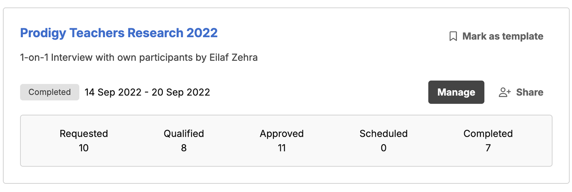
To test the hypotheses rather than design on assumptions, I ran 1:1 interviews with 7 teachers over one week in mid-September: what they expect from the page, what they actually come for, and where it fails their workflow.
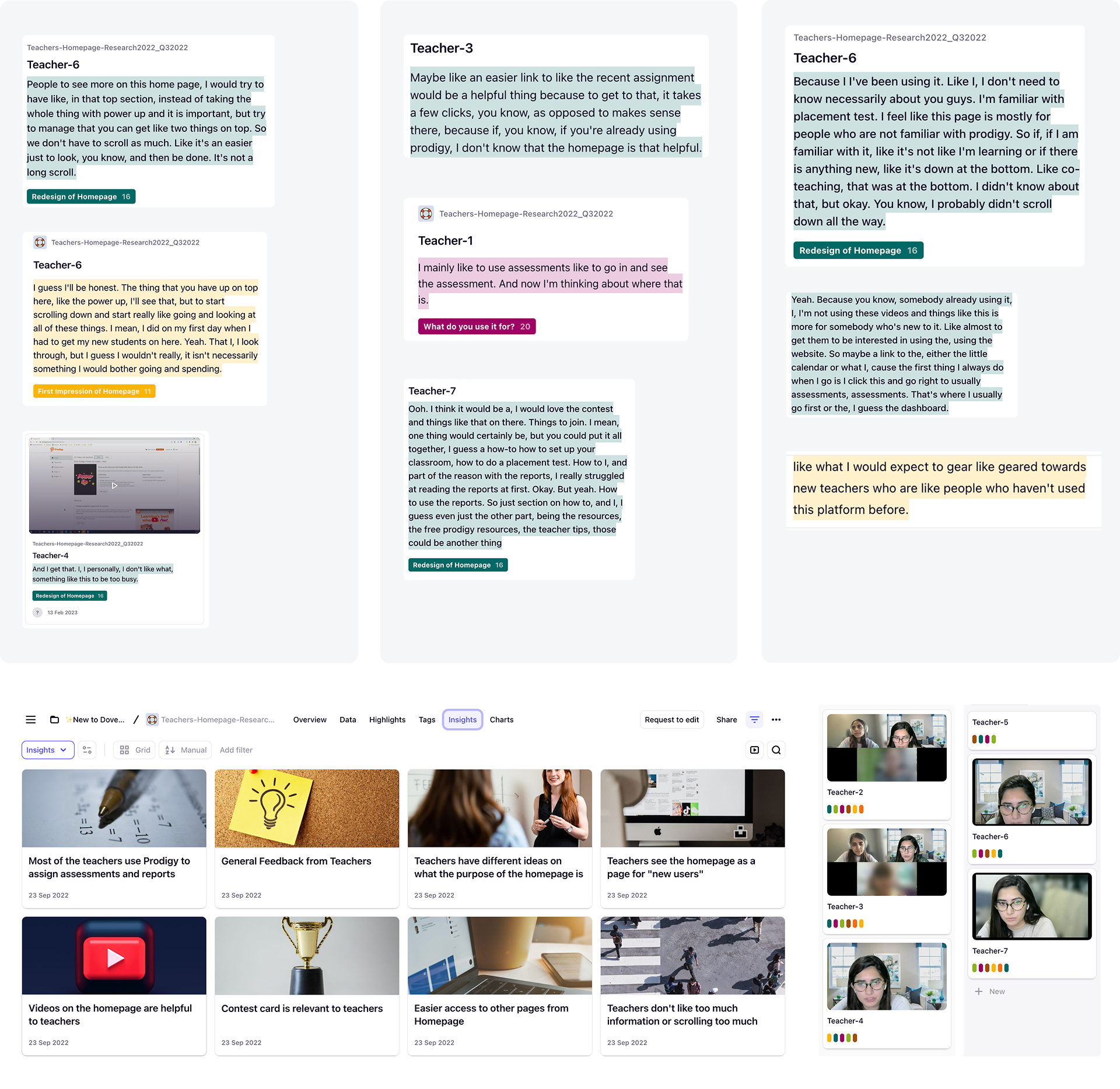
What teachers told us
😣 Too much to read
Long scrolls of promo content read as work. Teachers wanted the two things that matter on top, not a feed.
🎯 Few features carry the value
Reports, assessments, and goals are what teachers come back for. Everything else registered as noise.
👎 Nothing new for veterans
Experienced teachers had no reason to look: the page was pitched entirely at people who'd never used Prodigy.
What good looks like
- Simplify: cut the page to a few high-value actions.
- Make it actionable: every card reflects live classroom state, not static marketing.
- Move the metric: more teachers clicking through to core features.
05 · IDEATION
Two concepts, one trade-off
I brought the research back to the PM, explored two directions, and argued for the one we could validate fastest.
Concept 1: Onboarding checklist + habit prompts
Move the Getting Started checklist from the dashboard to the homepage so new teachers get immediate direction, then hand off to personalized prompts once they're activated.
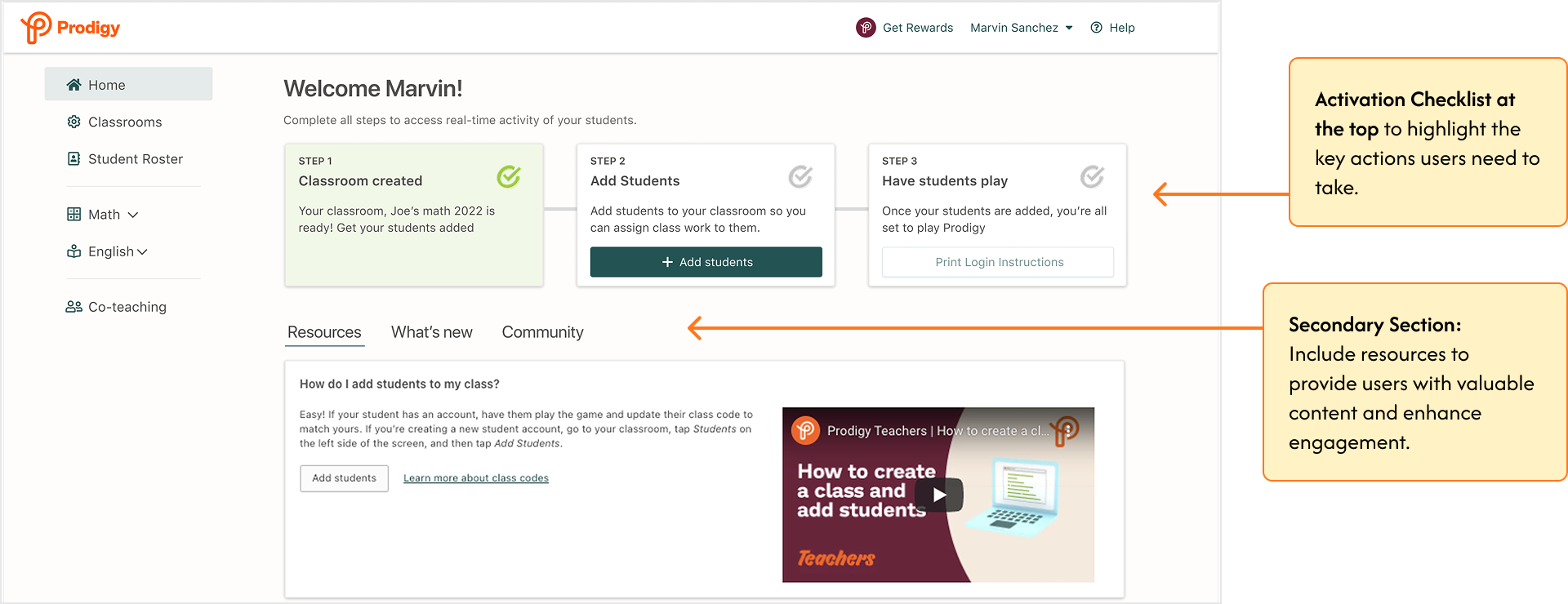
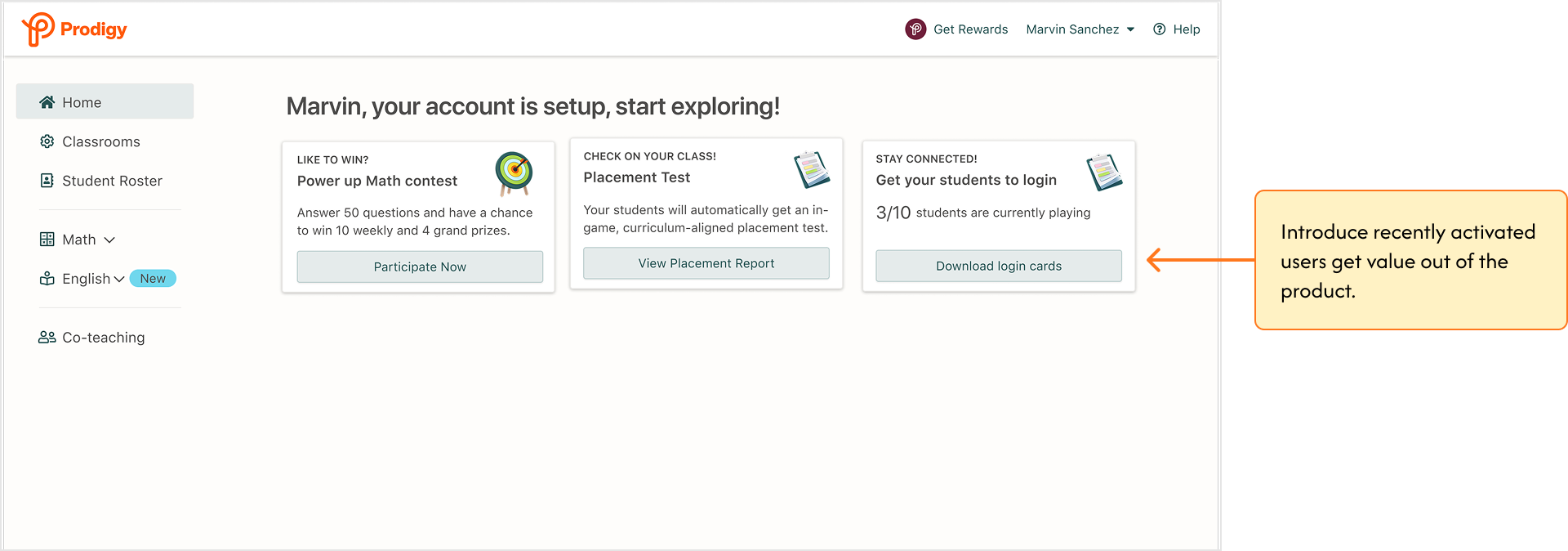
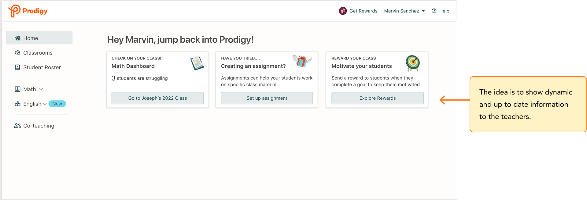
RISKS I FLAGGED WITH CONCEPT 1
- The checklist doesn't map cleanly to teachers with multiple classes.
- Teachers who skip it miss the actions it gates.
- The secondary content section could quietly become a banner graveyard again.
Concept 2: Three journey-aware cards
Strip the page to three cards above the fold, each surfacing one core-loop action matched to where the teacher is: setting up, activated, or returning.
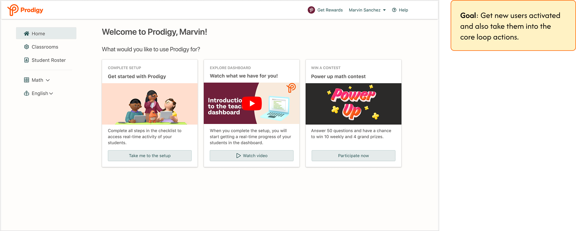
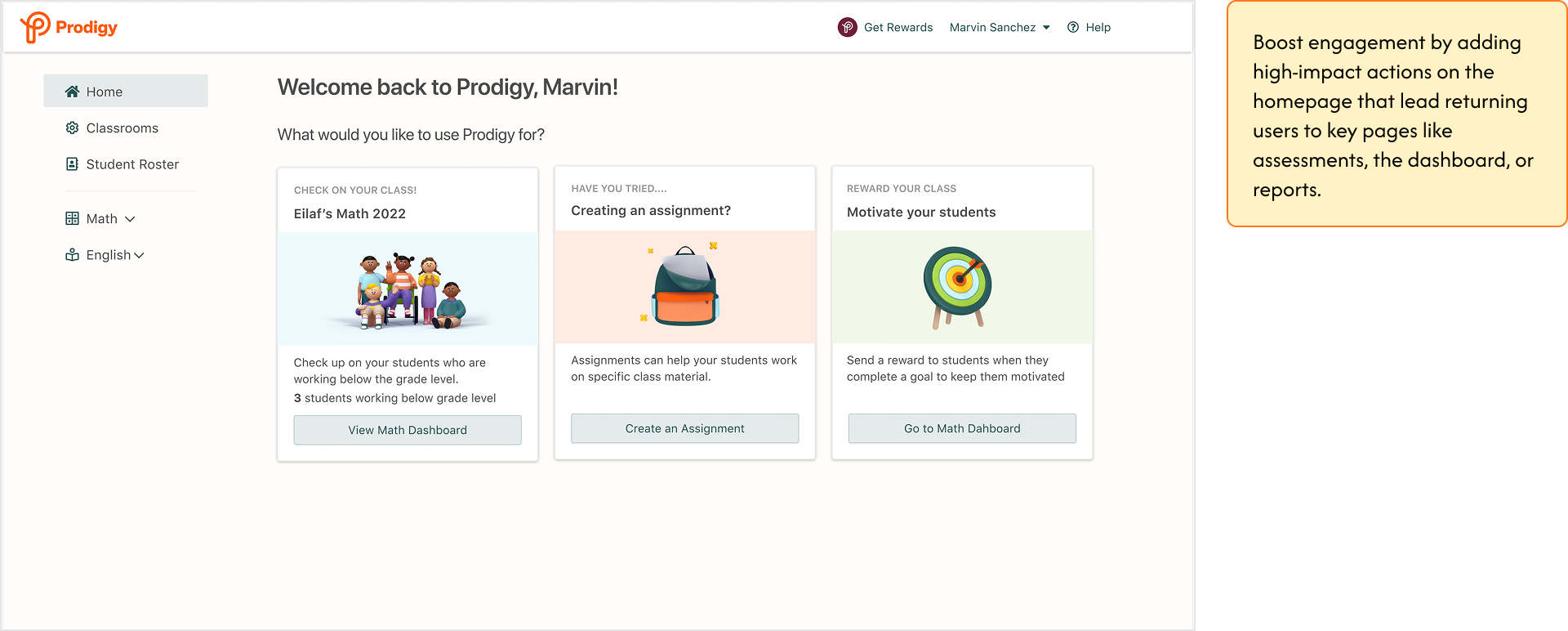
THE CALL
We went with Concept 2. Concept 1's risks demanded design time we couldn't justify before validating the basic premise that fewer, live-state CTAs beat a wall of banners. Concept 2 was cheaper to build, had fewer failure modes, and could be A/B tested within the quarter. Validate first, invest after.
06 · THE SYSTEM
Three cards that read the classroom
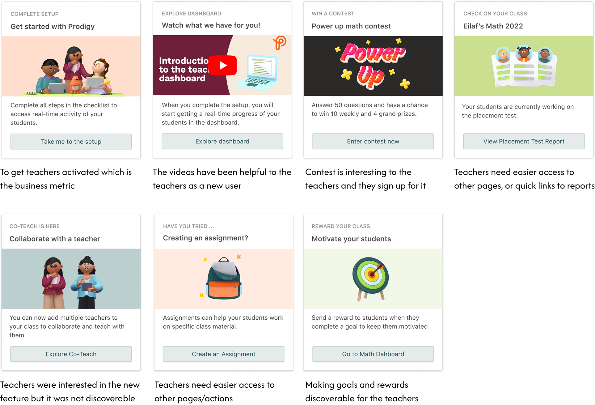
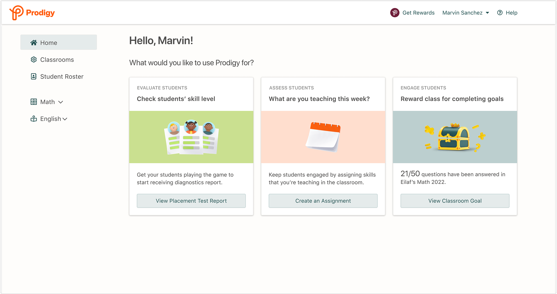
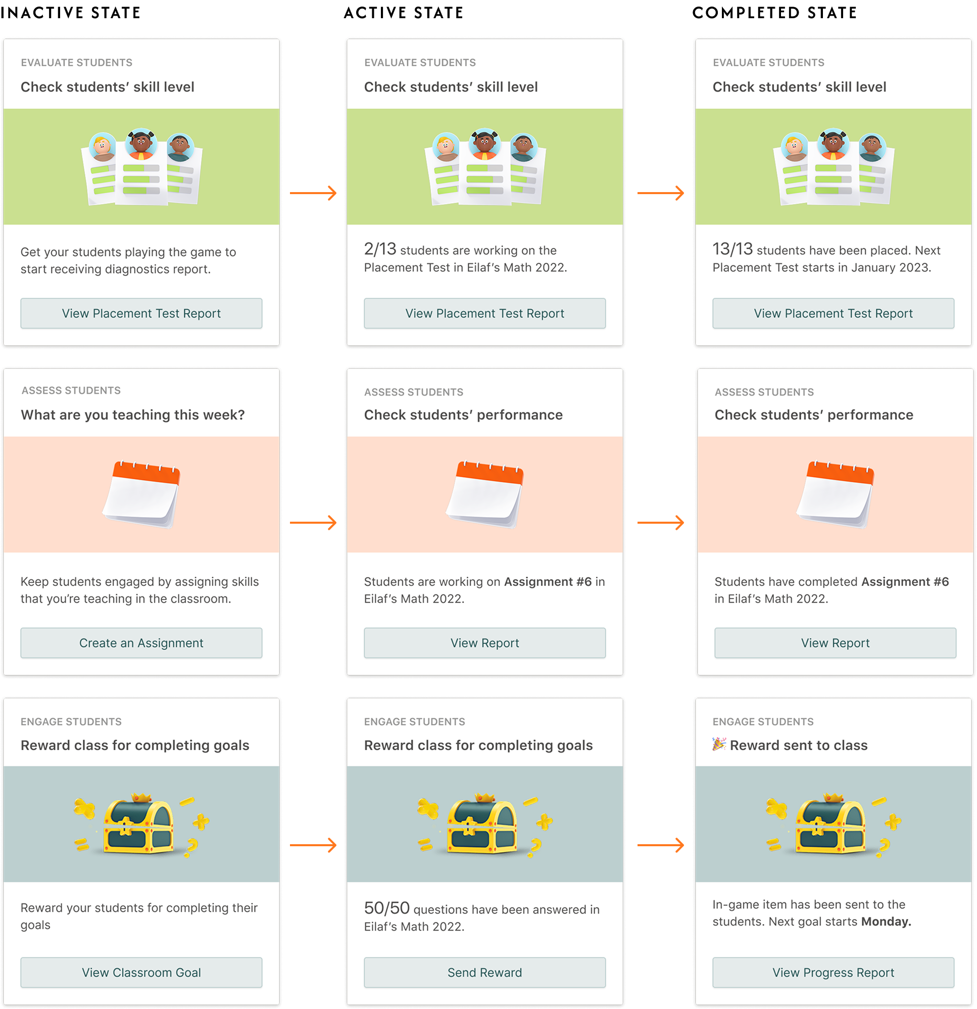
The final system has three fixed slots (Evaluate, Assess, Engage), each mapped to a core teacher job. Cards don't rotate marketing content; they read classroom state and update themselves: an empty class prompts setup, a running placement test shows live progress, a completed goal offers a reward to send.
My rationale behind the cards
I decided which content and actions to show on the homepage based on the data and research insights. Every card had to earn its place with evidence. The placement-test card came from teachers naming reports as their top reason to open Prodigy; the assignment card from teachers asking for faster paths into other pages; the rewards card from goals being valued but undiscoverable.
SCENARIO: NEW USER
Ella, a new Prodigy user, creates an account and completes onboarding. Landing on the homepage, she sees three actionable cards. To access student activity, she must first complete the Getting Started checklist, with the first card outlining her initial step. As she's unfamiliar with Prodigy's features, she watches a video to explore the dashboard.
SCENARIO: ACTIVATED USER
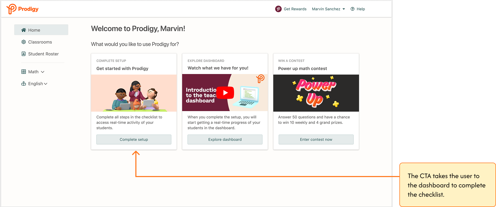
Ella has completed her setup. When she comes back to the homepage, she sees that her students are currently working on the placement test. With multiple classrooms, the page shows the most recently created class; 75% of teachers have only one class.
SCENARIO: RETURNING USER
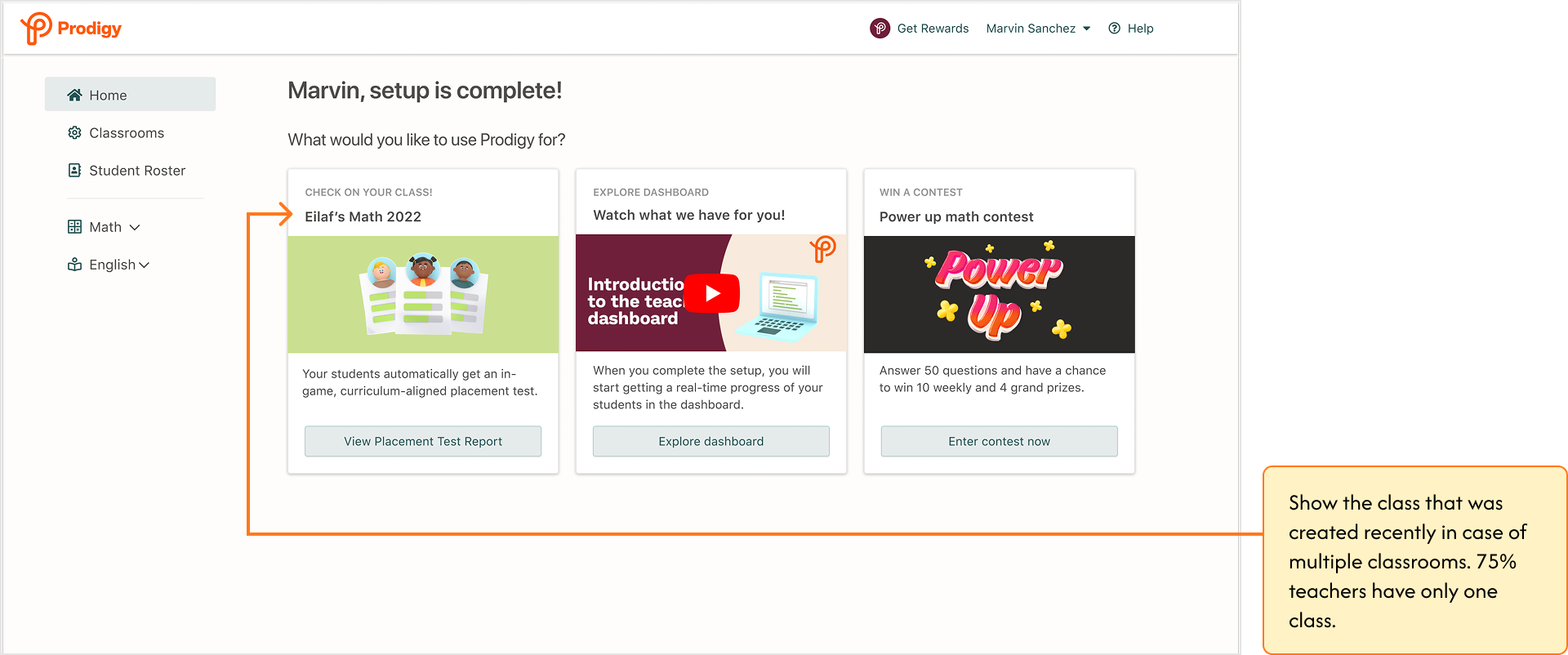
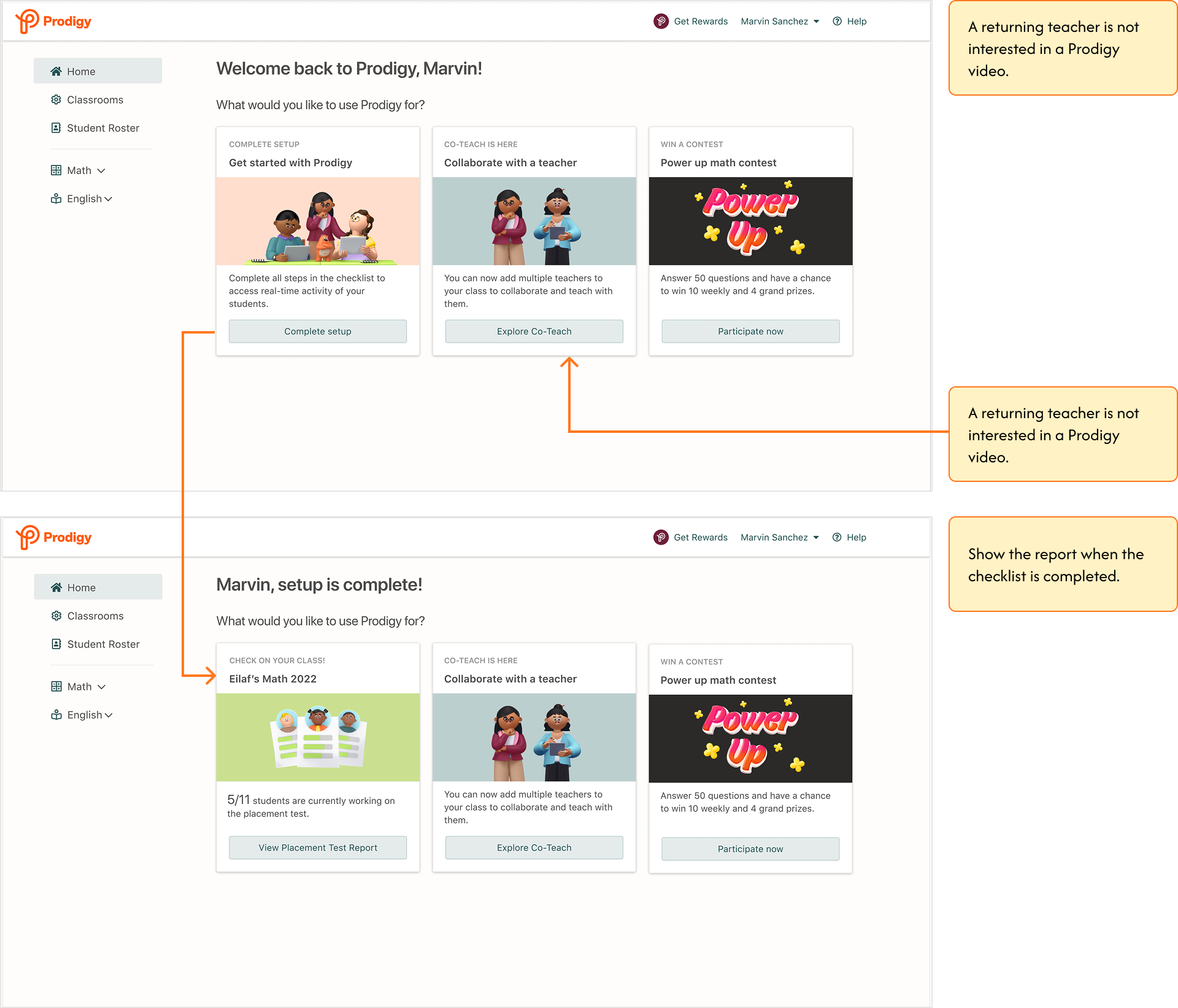
Sarah, an existing Prodigy teacher, returns after summer break to reactivate her account. She sees she needs to complete the checklist to start receiving student activity, and going through the page she discovers the Co-Teach feature. A returning teacher is not interested in a Prodigy video, so the page doesn't show her one, and her report appears once the checklist is complete.
Narrowing the test
Card states multiply fast across classrooms and user types, so we scoped the experiment to teachers with an active classroom and prioritized the most recent one. 75% of teachers have a single class; new and inactive teachers were excluded. A narrower test meant a cleaner signal, at the cost of coverage we'd have to earn back later.
07 · FINAL DESIGN
Designed for every state, not the happy path
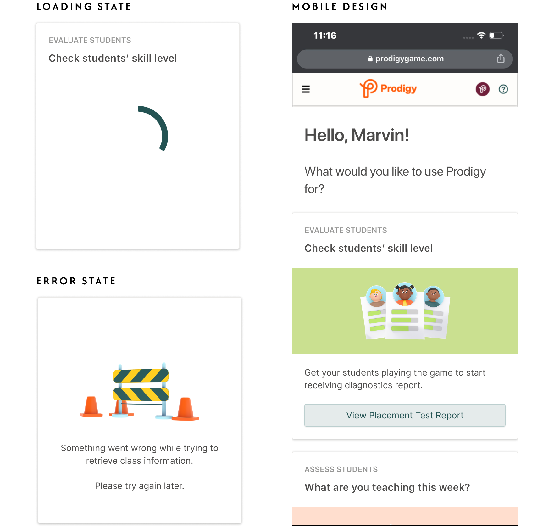
Each card moves through inactive, active, and completed states as the classroom does, so the page always answers "what should I do next?" and never shows a teacher the same thing twice once their class has moved on.
Handoff & QA
I documented every state and edge case in annotated Figma files, then ran a "break-it" session with engineering in staging, hunting layout breaks, stale data, and state mismatches across browsers before the experiment went live. Bugs are cheaper to find there than in the test data.
08 · THE EXPERIMENT
Testing it against the banner dump
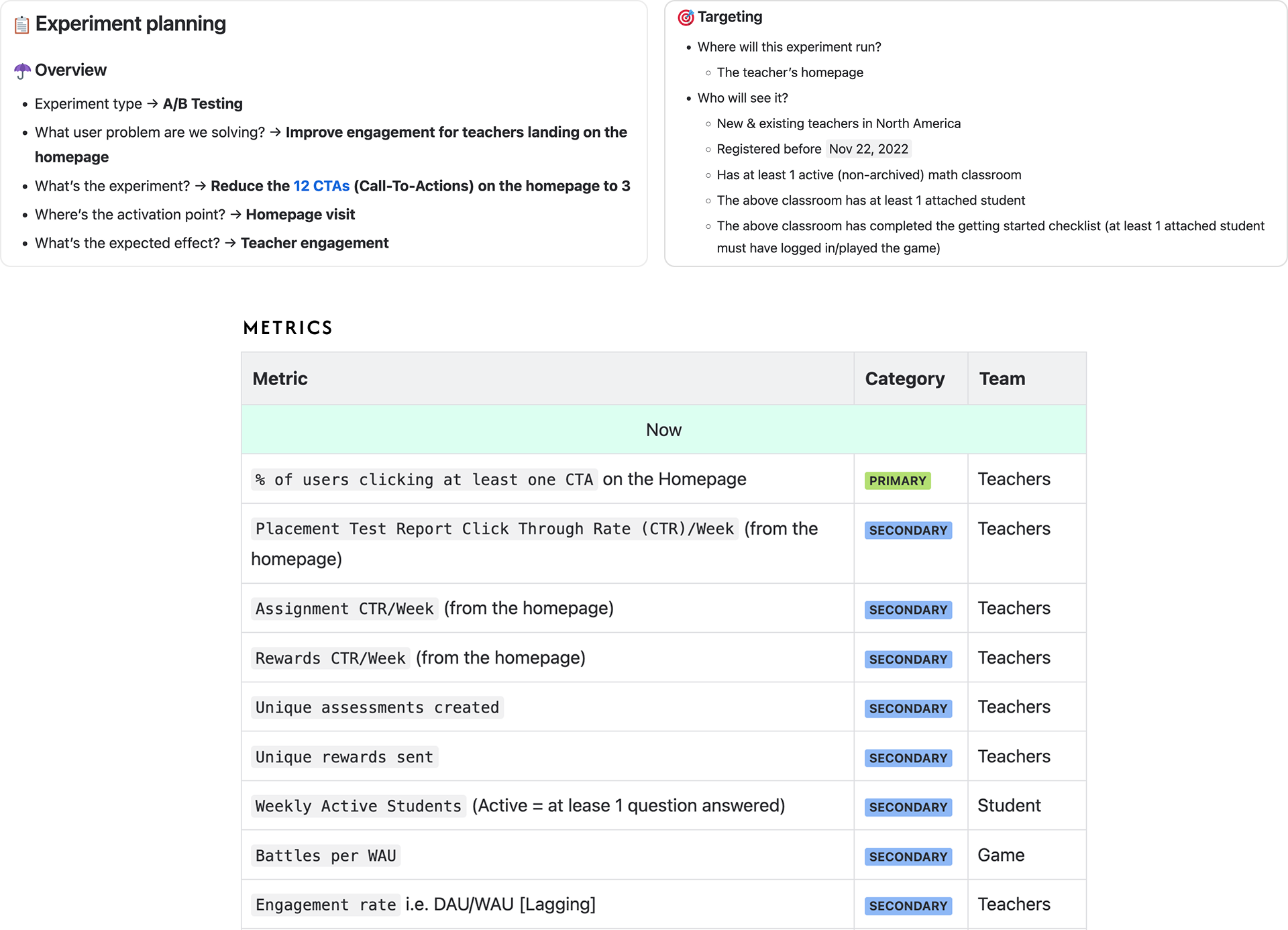
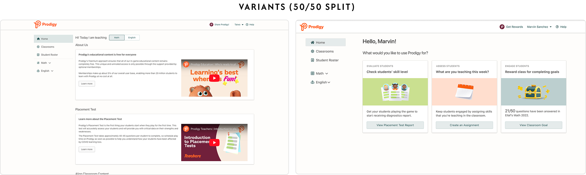
We ran a 50/50 A/B test against the existing homepage with North American teachers who had an active classroom. Primary metric: the share of teachers clicking at least one CTA on the homepage. Secondary metrics checked that clicks reached real work: placement-test reports, assignments, rewards, weekly active students.
Fewer, better CTAs
Cutting 12 CTAs to 3 didn't reduce action. It tripled it. Focus beat choice.
Live state beats static
Cards showing real classroom data outperformed marketing content that ages out.
It wasn't novelty
Repeat visitors engaged 134% more than control, so the lift held past the first look.

09 · OUTCOME
From pass-through to starting point
Given the significance, we rolled the new homepage out to all teachers. A page 80% of teachers passed through and ignored became the most direct route into Prodigy's core loop: evaluating, assessing, and engaging students.
8.5% → 26.5%
Teachers clicking at least one CTA on the homepage, before and after the redesign.
10 · NEXT STEPS
Where this goes next
Resolve the dashboard overlap
The homepage and dashboard now answer the same question in different ways. Decide which surface owns "what's next", or merge the two.
Serve multi-classroom teachers
38% of teachers had activity the page couldn't show. A classroom switcher on the homepage is the likely fix.
Personalize the slots
Let teachers pin the reports and pages they use most, and test it against the standard layout.
11 · REFLECTION
What I'd carry forward
Defending the problem is part of the job.
The hardest design work here wasn't the cards. It was making the case, with data, to fix content before touching navigation. Good work is often deciding what not to redesign.
Research bends to reality.
Back-to-school season meant 7 interviews instead of 20, and no usability rounds before the A/B test. Next time I'd trade some experiment polish for earlier teacher feedback.
The test has edges.
We proved the concept for active, single-classroom teachers. New teachers, multi-classroom teachers, and long-term retention are open questions the next iteration has to answer.
Thanks for reading.