Prodigy Education · Parent Experience · 2021 to 2022
Rebuilding the Parent app to speak more than Math
Due to confidentiality, I am unable to publicly display my work.
Prodigy Education · Parent Experience · 2021 to 2022
Rebuilding the Parent app to speak more than Math
Prodigy's parent app was built around a single subject: a flat navigation with Math assumptions baked into every page. With English (ELA) launching, I restructured the information architecture around subjects, validated it with card sorting, tree testing and usability testing, and shipped the parent experience for the January 2022 ELA beta.
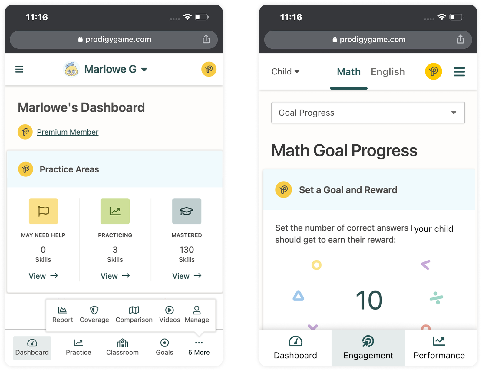
- Jan 2022
- ELA beta shipped on schedule
- 14 → 3
- Navigation items regrouped into three categories
- 2 × 10
- IA versions tree tested across ten tasks
- 7
- Competitor products analyzed
- My role
- Product Designer: IA, research, interaction and visual design
- Team
- Product Manager · 5 Engineers
- Timeline
- Nov 2021 to Mar 2022 · Shipped
- Tools
- Figma · Optimal Workshop · Dovetail
01 · CONTEXT
One app, one subject, and a second subject on the way
Prodigy's parent app gives parents a window into their child's learning: progress, practice areas, goals, report cards and memberships. It was built when Prodigy had exactly one subject, Math, and that assumption lived everywhere, from the navigation to the copy on every page.
Then Prodigy English (ELA) got a launch date: beta in January 2022, full launch in March. Parents needed visibility into a second subject, and the business needed an app that could scale to any future subject without a rebuild each time.
Theresa is who we designed for: a parent of two girls at different grade levels, splitting homework help with her husband, already using Prodigy passively for Math. Her younger daughter is working through reading struggles, which is exactly the subject the app could not yet show her.

Parent persona · Supportive tutor parent
Theresa
Two daughters: Eva, 9, ahead in school • Emma, 7, working through reading and math struggles • Splits homework help with her husband • Family time is sacred, free time is scarce
“I encourage my children to use educational materials whenever possible instead of just going on YouTube. I want to make sure my daughters are appropriately challenged as they learn.”
Goals
- Keep both daughters motivated by showing them the value of education
- Support two very different ages and abilities, equally
- Play an active role in her daughters' learning
Behaviours
- Supplements school with workbooks, flashcards and after school activities
- Checks in with teachers regularly, in person and through apps
- Limits screen time, unless it is educational
Frustrations
- Her daughters are bored at school or challenged at the wrong level
- Busy work and a confusing curriculum sent home from school
- Lack of time: she tries to do it all, too often
Experience with Prodigy
Passive so far: she created a parent account, reads the progress emails, and sets goals and rewards when her daughters remind her. She likes that Prodigy is fun while staying educational, but she isn't sure what a membership offers beyond enjoyment. Math is the only subject she can see.
HOW MIGHT WE
Simplify the parent experience so it scales to other subjects like ELA, using the existing infrastructure of the parent app rather than building new.
02 · THE PROBLEM
An architecture that could not hold a second subject
The navigation was a flat list of fourteen destinations: eight Math features (Dashboard, Practice Areas, Classroom Learning, Goal Progress, Report Card, Comparison Insights, Curriculum Coverage, Video Lessons) sitting beside six account and utility items like My Children, Memberships and Math Tutoring. Duplicating that list per subject would double it with every launch; bolting ELA links into it would bury them.
No room to scale
Every feature assumed Math. A second subject meant either a duplicate of everything or an app that quietly stopped making sense.
No mental model
Fourteen siblings in a flat list gave parents no grouping to lean on. Adding a subject dimension on top would make an unclear structure worse.
No feature parity
The ELA beta would ship with only a subset of Math's features, and some might never come to ELA at all. A copied navigation would be full of empty entries on day one.
Current information architecture · What sits at level one
1 click deep. 14 siblings. No level two worth the name.
- Dashboard
- Practice Areas
- Classroom Learning
- Goal Progress
- Report Card
- Comparison Insights
- Curriculum Coverage
- Video Lessons
- My Children
- Manage Child
- Memberships
- Math Tutoring
- Account Settings
- Help
Fourteen destinations on one level. No grouping for parents to lean on.
Learning features and account settings branch from the same root, with nothing separating them.
Every branch assumes Math. There is nowhere for a second subject to attach.
Learning feature Account and settings
The navigation before ELA: the first level of the information architecture, exactly as parents saw it.
03 · THE CONSTRAINT
Scale the existing app, not build a new one
With a hard beta date in January, building a separate ELA experience was never on the table, and it would have been the wrong call anyway: parents think in children and subjects, not in apps. The brief I set with the team: reuse the existing infrastructure, restructure the information architecture so subjects become a first class dimension, and touch as few backend systems as possible.
That turned the project from a feature launch into an information architecture problem, on a four week clock: audit to developer handoff ran Nov 10 to Dec 10, with the beta landing in January. The questions that mattered: where does the subject live in the hierarchy, and what grouping makes fourteen destinations navigable?
04 · RESEARCH
How other products handle more than one subject
I started with an audit of the current app and a competitive analysis of seven products that already juggle multiple subjects: SplashLearn, ReadWorks, Education.com, Sumdog, Khan Academy, Freckle and IXL.
Switchers, three ways
A toggle between Math and English, a drop-down, or a separate page per subject. SplashLearn lays out both dashboards the same way, so the switch costs nothing to relearn.
Per child, then per subject
Every product anchors on the child first. The subject is a lens inside the child's space, never a separate world.
Parallel structure wins
Where the two subjects share a layout, parents transfer their habits. Where they diverge, every switch becomes relearning.
SEVEN PRODUCTS · HOW EACH HANDLES MORE THAN ONE SUBJECT
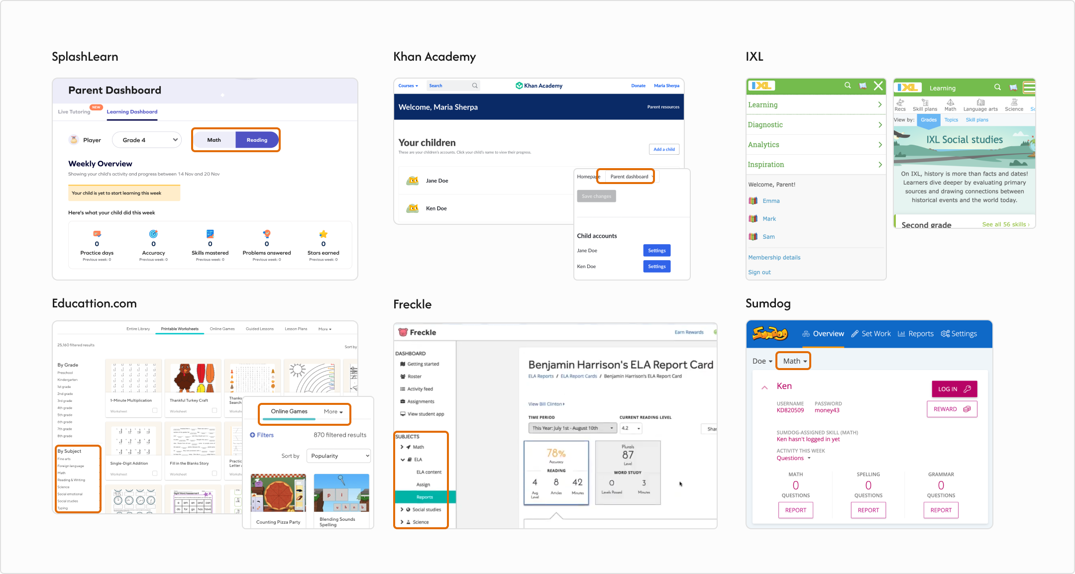
| Product | Where the subject lives | What it told us |
|---|---|---|
| SplashLearn | Math/English switcher in the dashboard, same layout both sides | Subject as a switch works, and parallel layouts mean nothing to relearn |
| Khan Academy | Child first, each child their own dashboard, subject inside | The child, not the subject, is the top of the hierarchy |
| Sumdog | A drop-down on web, a separate switch page elsewhere | Drop-downs scale but hide; a dedicated switch page is friction |
| Education.com | A resource library per subject | A library is browsing, not navigation; parents need structure |
| ReadWorks | Subject declared during parent onboarding | The subject question can be asked once, early, instead of navigated daily |
| Freckle | A subjects tree in the sidebar: Math, ELA, Social studies, Science, each repeating its own content, assign and reports | Subject-first scales in the menu, but it multiplies every feature per subject |
| IXL | Function categories first (Learning, Diagnostic, Analytics), with subjects as a row inside each | Stable categories survive any number of subjects |
The audit and analysis pointed at a model: child first, then subject as a switch, then a small set of stable categories that work for any subject. The open question was what those categories should be, and what to call them.
05 · IA VALIDATION
Card sorting, then tree testing two architectures
I ran an internal card sort to form candidate groupings, then built two competing IAs and tree tested them against each other across ten realistic parent tasks.
How the navigation was validated
- Card sorting
- Creating categories
- Two competing IAs
- Tree testing, 10 tasks
Internal card sort · The same feature cards, sorted three ways
Sort 1 · By price
Broke down: parents don't think in plans. A feature's price tier says nothing about when a parent needs it.
Sort 2 · By app structure
Broke down: five sections for fourteen features, and Insights became a junk drawer.
Sort 3 · By parent intent
Held, with one flaw: the Learning pile was too big. Splitting it became the question the two trees were built to answer.
The intent sort won, but its oversized Learning pile forced the real question: split it by activity (Engagement and Performance) or by theme (Engage, Educate, Evaluate)? That is exactly what the two trees below put to the test.
The two architectures under test · Both levels as tested
Version one
Familiar, function first labels: Dashboard, Engagement, Performance, Settings.
Selected after testing- Goal Progress
- Practice Areas
- Video Lessons
- Lesson Plans
- Report Card
- Comparison Insights
- Classroom Learning
- Curriculum Coverage
- Account Settings
- My Children
- – Child settings
- Log out
Version two
Themed, intent first labels: Dashboard, Engage, Educate, Evaluate, Settings.
- Goal Progress
- Practice Areas
- Curriculum Coverage
- Video Lessons
- Lesson Plans
- Report Card
- Comparison Insights
- Classroom Learning
- Account settings
- My Children
- – Child Settings
- Log out
Highlighted categories are the labels under test. Child settings sits under My Children in both versions. Category names considered and dropped before testing: Analytics, Knowledge Center, Learning Hub, Enrichment.
Label under test Unchanged
Tree test · Task success, Tree 1 vs Tree 2
| T1 | T2 | T3 | T4 * | T5 | T6 | T7 | T8 * | T9 † | T10 | |
|---|---|---|---|---|---|---|---|---|---|---|
| Tree 1 | 51% | 62% | 56% | 24% | 46% | 56% | 41% | 9% | 29% | 47% |
| Tree 2 | 32% | 90% | 48% | 26% | 10% | 35% | 42% | 16% | 32% | 55% |
* Tasks 4 and 8 failed in both trees and went to usability testing. † Task 9 invalid: the task wording leaked the answer.
Tree 1 averaged 42% against 39%, with the deciding gaps on tasks 1, 5 and 6, where plain labels beat themed ones. The full board with per task findings lives in the working file.
What the tests settled
- Labels won task by task, not tree by tree: Evaluate confused people while Performance found the features, with gaps of 19 to 36 points on the deciding tasks.
- Engagement edged out Engage: both worked, but the familiar word had the better success rate, so it kept its place.
- Settings placement was validated, and Manage Child earned a clearer name, Child Settings.
- Three tasks stayed ambiguous, so they were flagged for usability testing on low-fi designs instead of being decided by opinion.
The shipped navigation assembled the per-task winners: Dashboard, Engagement, Performance.
06 · IDEATION
Where does the subject live? Seven navigation options
With the categories validated, the remaining question was the subject switch itself. I explored it as tabs, drop-downs and split menus on web and mobile, keeping the Math and English structures deliberately parallel.
Considered and rejected
Version A: Tabs with features in the side menu
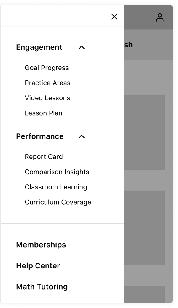
Why not: the main features end up hidden inside the side menu.
Version B: Features in the floating menu
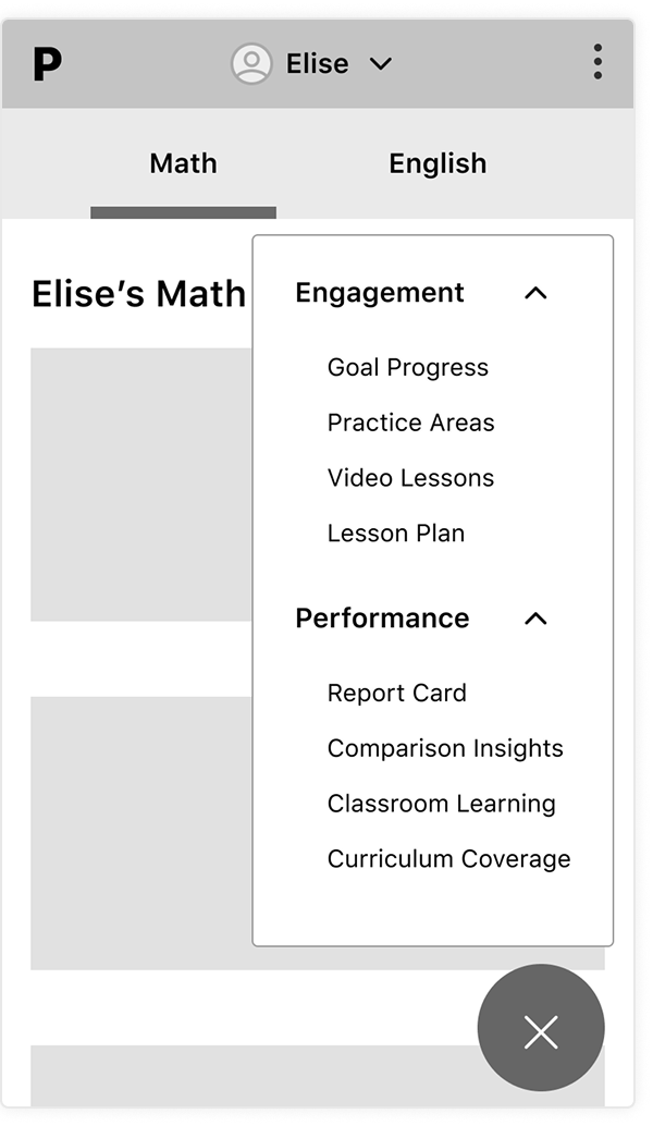
Why not: the features inside the menu are not discoverable at a glance.
Version C: Tabs with features in a drop-down
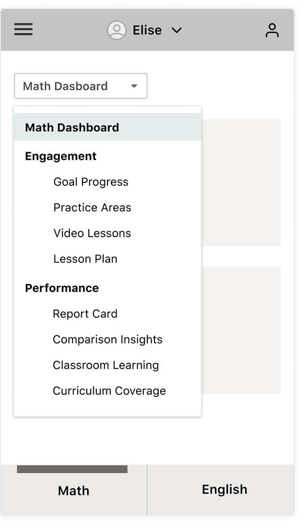
Why not: every feature hides inside one drop-down, invisible at a glance.
Version D: Features grouped as tabs Selected
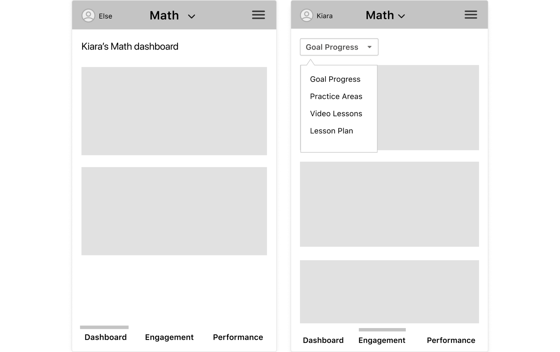
Pros: Thumb friendly tabs keep the three categories always visible and reachable, the structure mirrors the web navigation, and the in-tab dropdown scales by growing a list instead of the nav. Subject switching stays separate in the header. Cons: Features still sit one level deep behind the dropdown.
THE CALL
We went with Version D. Every option hid features one level deep, so instant discoverability was lost either way; Version D loses it with the least damage. Bottom tabs keep the three categories always visible and thumb reachable, the structure mirrors the web navigation so nothing is relearned across devices, and the in-tab dropdown scales by growing a list instead of the nav. Subject, section and feature each get their own control, which is the same child, subject, category logic the whole IA is built on.
07 · THE SYSTEM
Child, then subject, then three categories
The final architecture collapses the flat fourteen item list into a hierarchy parents can predict. Pick the child, pick the subject, and every subject offers the same three groups: Dashboard for the overview, Engagement for acting (Goal Progress, Practice Areas, Video Lessons, Lesson Plans), and Performance for understanding (Report Card, Comparison Insights, Classroom Learning, Curriculum Coverage).
Subject tabs
Math and English sit side by side in the child's space. Adding a third subject is adding a tab, not redesigning the app.
Parallel structure
Both subjects share one layout, so nothing has to be relearned on switch. English simply shows fewer modules until its features catch up.
Honest labels
Performance beat Evaluate in testing; Manage Child became Child Settings. Labels came from parents' words, not ours.
From fourteen destinations to three categories
Before • One flat list
Parent app (Math only)- Dashboard
- Practice Areas
- Classroom Learning
- Goal Progress
- Report Card
- Comparison Insights
- Curriculum Coverage
- Video Lessons
- My Children
- Manage Child
- Memberships
- Math Tutoring
- Account Settings
- Help
14 → 3
fourteen destinations become three categories per subject
After • Child, then subject, then three categories
Your childThe overview. Same spot in every subject.
- Goal Progress
- Practice Areas
- Video Lessons
- Lesson Plans
- Report Card
- Comparison Insights
- Classroom Learning
- Curriculum Coverage
Shared account level • Outside the subject
Learning feature Account and settings Subject switch
The shipped hierarchy beside the flat list it replaced. Every subject carries the same three categories, and account items sit outside the subject.
08 · FINAL DESIGN
Two subjects, one experience, on web and mobile
The Math and English dashboards shipped as mirror images: grade level, weekly questions answered, recent activity and curriculum progress in the same positions, with subject specific content inside the modules. English launched with grades 1 to 5 and clear messaging about its narrower coverage, rather than pretending parity it didn't have.
On web, the same hierarchy reads as tabs. The child drop-down sits at the global level in the header: change the child and every dashboard follows, with no page by page reselecting. Math and English sit side by side in the child's space, and under each the structure is identical: Dashboard for the overview, Engagement for acting, Performance for understanding. Nothing has to be relearned on switch; English shows the same three categories and fills in features as they catch up.
The prototype walks the shipped navigation end to end. The child and the subject live in the header: pick the child, then switch between Math and English without leaving the page.
The bottom tabs hold the three categories, Dashboard, Engagement and Performance, always visible and thumb reachable. Inside a category, a drop-down hops between sibling features like Goal Progress, Practice Areas, Video Lessons and Lesson Plans, so the navigation never grows as the feature list does. The system also makes choices so parents don't have to: Math is the default subject on sign in, the child drop-down preselects the child with the most recent activity, and the tab bar stays sticky while the feature drop-down scrolls away. Switching to English from a feature English doesn't have yet lands on a designed empty state instead of a dead end.
09 · USABILITY TESTING
Testing the words, twice
The ambiguous tasks from the tree test went to usability testing on low-fi designs with eight parents. The tree test had already measured Engagement across ten tasks, so this round asked a different question: would the words parents actually use work better? In sessions, parents described the middle category in their own vocabulary, activities and learning, so we tested Activity Center and Learning against the tasks parents bring to the app.
Research insights on Dovetail
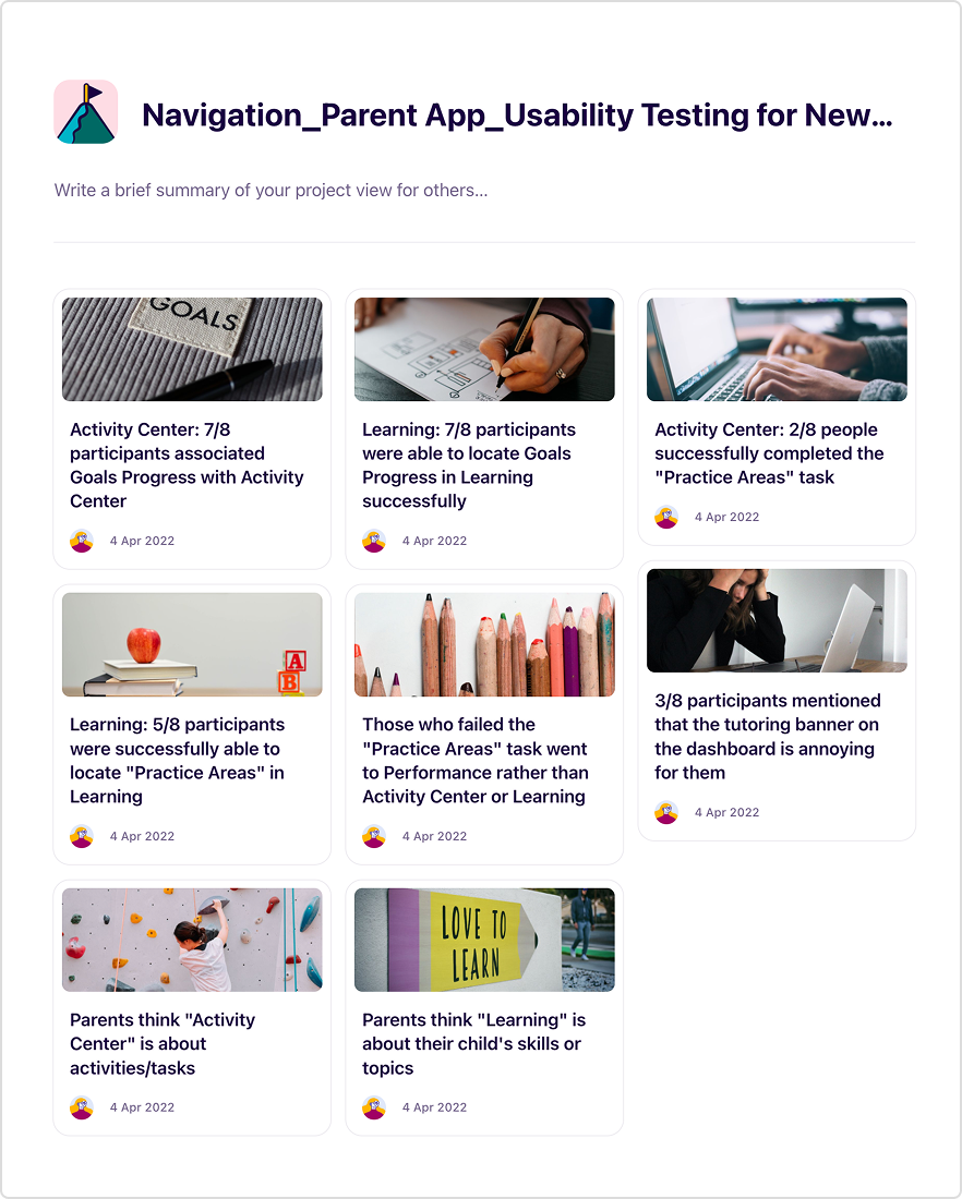
The easy task passed either way
Seven of eight parents found Goal Progress under Activity Center, and seven of eight under Learning. The category idea worked no matter the word.
The hard task split the words
Practice Areas succeeded for five of eight under Learning and two of eight under Activity Center. Each word set its own expectation: tasks for Activity Center, skills for Learning.
Misses were systematic
Parents who missed went to Performance, not nowhere. They navigated by meaning, so the three category structure held even when a label misled.
THE CALL
Learning edged Activity Center, but neither cleared the bar. Engagement had tree test data behind it, Activity Center biased parents toward tasks, Learning biased them toward skills, and neither reliably surfaced Practice Areas. We kept Engagement: not the word parents say, but the word that does not mislead them.
10 · OUTCOME
ELA shipped on an architecture built for subjects
The ELA parent experience shipped for the January 2022 beta and the March full launch, on time, on the existing infrastructure. The deeper outcome is structural: subjects are now a dimension of the app rather than its identity, so the next subject is a tab and a content pass, not a redesign.
11 · NEXT STEPS
Close the feature gap
English launched with fewer features than Math. Watch which missing ones parents look for first, and build them in that order.
Plan for more than 3 subjects
Subject tabs work well for two or three subjects. If Prodigy adds a fourth, the tabs run out of room, so the switcher needs a rethink before that happens.
Add navigation analytics
Adoption and support data told us the launch worked. The next step is tracking the navigation itself, which features parents reach and how directly, so the testing results are confirmed by real usage.
12 · REFLECTION
What I'd carry forward
Test the words, not just the screens.
The research that changed outcomes most was about labels. Swapping Evaluate for Performance moved task success more than any visual change, and it cost only a two day tree test.
Name your research errors.
One tree test task was worded in a way that gave the answer away, so I excluded it and said so. Admitting the flawed task kept the rest of the results trustworthy.
Parallel structure is a design feature.
Making English mirror Math was a deliberate choice. Parents never had to relearn anything for the second subject, and it is why adding a third will be cheap.